A lot of site visitors have a real appreciation of how web sites are built and will form their opinion based on more than words and looks. This article illustrates how a knowledgeable and discerning visitor might look beneath the surface and judge your site. He can easily inspect the markup, the stylesheets and script code. The point is illustrated through the eyes of Stuart (a persona used elsewhere on this site).
Technical Quality of a Web Site
Last edited 2005-11-15

A quick inspection of a web site can be very revealing. (This is illustrated by a visitor, called Stuart, including details of the tools he uses.)
Stuart, like many others, has created web content and appreciates how it is done. This experience colours his opinions. If all else is equal he may take a look inside, particularly if he is making a buy decision. Sites that are sloppy on all fronts help him make his decision.
He has an appreciation for the realities of the web and understands some of it's limitations. (He is fairly up to date on what is happening on the web.) In the past he has seen a lot of vigorous and uninformed debate about the Internet. Much of it sensational and misleading. This has lead him to form his own opinions.
He is not blind to the shortcomings of the web. He knows that browsers and the Internet could be a lot better. For instance some of the changes he would prefer to see are:
- More powerful controls inside browsers (like navigation bars, collapsing lists, live controls that don't need refresh...) rather than JavaScript fixes to achieve these things.
- Vector image support inside browsers (like the Scalable Vector Graphics idea) and transparent images.
- A way to embody navigation and suchlike inside the browser without repeating those details on every page.
This insight means that he is realistic in his opinions. He judges on what he knows is possible and sensible. (That makes him an ideal visitor from the viewpoint of a web designer as he isn't plagued by too many unrealistic expectations.)
He knows about the reality of creating flat pages, program driven pages, linking to databases and the issues of communicating between a web page and a server. One result is he especially approves of a site that avoids unnecessary program driven pages.
He likes web sites that get to the point and are elegant, simple and good looking. Behind the scenes he looks for:
- Markup that he can respect. He thinks that the dialect known as XHTML 1.0 Transitional is particularly sensible. He expects it to be easy to read, neatly laid out and simple. He is unimpressed by tags, particularly in the head section, that can be safely removed.
- Styling that largely depends on CSS. He has seen the power and flexibility of this technology and (now that it is generally available) likes to see it used. He believes that the table tag still has it's place (despite claims to the contrary) though thinks it should be used sparingly.
- Organised Scripting. Script on pages is often a messy patchwork of different code versions, in several blocks with redundant code. He appreciates pages where the script is separated into different files, is neatly formatted and well coded. When he does look at it a real mess will colour his opinion. He can understand some messiness where this comes from third party code that performs some special function and may be impractical to fix.
- Wise use of program driven pages. Some pages need to be generated in part by programs. Others don't. He likes to see sites that know the difference and don't waste his time by needlessly generating content over and over again. He also understands that some programming systems create atrocious markup. (He will cut a web site some slack when he sees it is using such tools.)

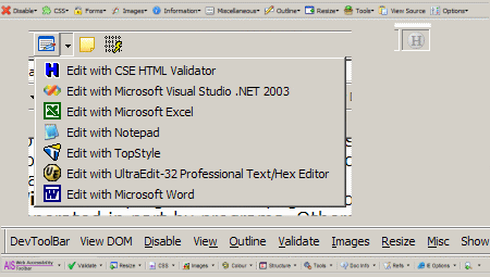
Being practical, he isn't prepared to spend a lot of time checking. Fortunately he finds that he doesn't need to. He uses several tools to give him a look beneath the surface. These are developer toolbars in his two browsers (Internet Explorer and FireFox), a markup validator and a stylesheet tool. (Free versions of these tools are available so any web site owner can see roughly what he sees.) Using these tools is best experienced, rather than described. If you want to find out what they do we suggest you load them up and test:
- Toolbars: The Firefox toolbar is listed as a FireFox add-on under the name Web Developer, it can be added using the Firefox extensions tool. (It requires that Firefox be restarted.) There is a similar tool for Internet Explorer known as the Internet Explorer Developer Toolbar. This can be downloaded from the Microsoft site. (Another tools he sometimes uses is the NILS Accessibility Toolbar. That is also available free on the Internet.)
- Syntax checker. With his experience he knows that all syntax checkers can be overzealous at times, despite this he finds them essential. He uses a product called CSE HTML Validator, which gives him a way to rapidly identify flaky markup on web sites. (The downloadable free/lite version of this product is about 3.8 MB in size.)
- CSS checker. Savvy visitors, like Stuart, know that CSS can identify web sites that are built really professionally. Unfortunately CSS is not easy to write or review in a text editor, so specialised tools are a good idea. Stuart uses a tool called TopStyle. A cut down free version of this is available from the supplier NewsGator (originally Bradsoft). (In October 2007 a revised version, 3.5, was released.)
For the reader who has not experienced this view of web pages, I recommend an immersive experience in two parts:
- Experiment with your own web page editing. Here is one way that you can do this in a few hours.
- Load up the tools and have a look at some web sites using them. Be prepared, a lot of sites are horrible under the covers. (When you're aware of that, you stand a chance of making a better impression with your own site.)


